I love maximalist color—but I won’t trade legibility for vibes. This post is a small handbook on how I keep **Bambicim** delightfully pink *and* easy to read: color tokens, contrast rules, motion etiquette, and component patterns.
---
## 1) Color system: pink for *accent*, neutrals for *reading*
Pink carries **emotion**, not paragraphs. Text stays neutral and high-contrast; pink sits in borders, glows, shadows and focus rings.
```css
/* tokens.css */
:root {
/* brand */
--pink-400: #ff5ecf;
--pink-500: #ff3fb6;
--pink-600: #e22ea4;
--pink-700: #b51f86;
/* neutrals (dark theme) */
--surface-950: #0f0c11; /* page bg */
--surface-900: #16131a; /* cards */
--surface-800: #1e1a23; /* hovers */
--text-contrast: #f6f2f8; /* main text on dark */
--text-muted: #c8bfd2;
/* state */
--ring-pink: 0 0 0 3px rgba(255, 63, 182, .45);
}
Pink usage rules
No pink body text on dark. Use --text-contrast or --text-muted.
Pink backgrounds must keep text contrast ≥ 4.5:1 (AA). That usually means dark text on light-pink or white text on deep pink (≥ --pink-700).
Gradients are decorative, never behind copy. If a gradient nears text, I overlay a neutral scrim: linear-gradient(#16131a66, #16131a66).
Quick contrast sanity
If I’m tempted to use pink for text, I run the ratio. A rough mental check:
white #fff on --pink-500 ≈ 3.0:1 → fail
white on --pink-700 ≈ 4.6:1 → pass
#201a25 on light-pink #ffd3ef ≈ 9+:1 → strong pass
2) Typography that behaves
Long-form reading should feel quiet. I keep line length around 65–75ch and scale typography with clamp() so it doesn’t explode on ultrawide screens.
:root {
--step--1: clamp(.9rem, .85rem + .2vw, 1.0rem);
--step-0: clamp(1.0rem, 1.0rem + .3vw, 1.15rem);
--step-1: clamp(1.15rem, 1.05rem + .5vw, 1.35rem);
--step-2: clamp(1.6rem, 1.3rem + 1.2vw, 2.2rem); /* H1 */
}
.prose {
max-width: 72ch;
font-size: var(--step-0);
line-height: 1.6;
}
Headlines never exceed two lines; if they do, I trim the words—not the font size.
3) Motion tokens (and how I respect “reduce motion”)
Motion is seasoning, not the meal. I define timing once and reuse it.
:root {
--ease-emphasized: cubic-bezier(.2, .0, 0, 1);
--t-fast: 150ms;
--t-med: 220ms;
--t-slow: 320ms;
}
.card {
transition: transform var(--t-med) var(--ease-emphasized),
box-shadow var(--t-med) var(--ease-emphasized);
}
.card:hover { transform: translateY(-2px); }
Accessibility switch:
@media (prefers-reduced-motion: reduce) {
* { animation: none !important; transition: none !important; }
}
Rule: No parallax for content. Micro-scale ≤ 1.02. Motion should help orientation (hover, focus, state changes), not show off.
4) Components that feel nice and pass checks
Buttons
Hit area ≥ 44×44px.
Rest → Hover → Active all increase contrast, never decrease.
.btn {
--bg: var(--pink-600);
--bg-hover: var(--pink-700);
color: #fff; background: var(--bg);
padding: .7rem 1rem; border-radius: 14px;
transition: background var(--t-fast) var(--ease-emphasized), transform var(--t-fast);
}
.btn:hover { background: var(--bg-hover); transform: translateY(-1px); }
.btn:focus-visible { outline: none; box-shadow: var(--ring-pink); }
Cards
Keep copy on neutral surfaces; put pink in the edge work (border/glow/shadow).
Lift on hover with a subtle y-translation and higher shadow, not lower contrast.
Forms
Label outside inputs; useful placeholder text, not instruction-only.
Error appears next to the field with role + color + icon (don’t rely on color alone).
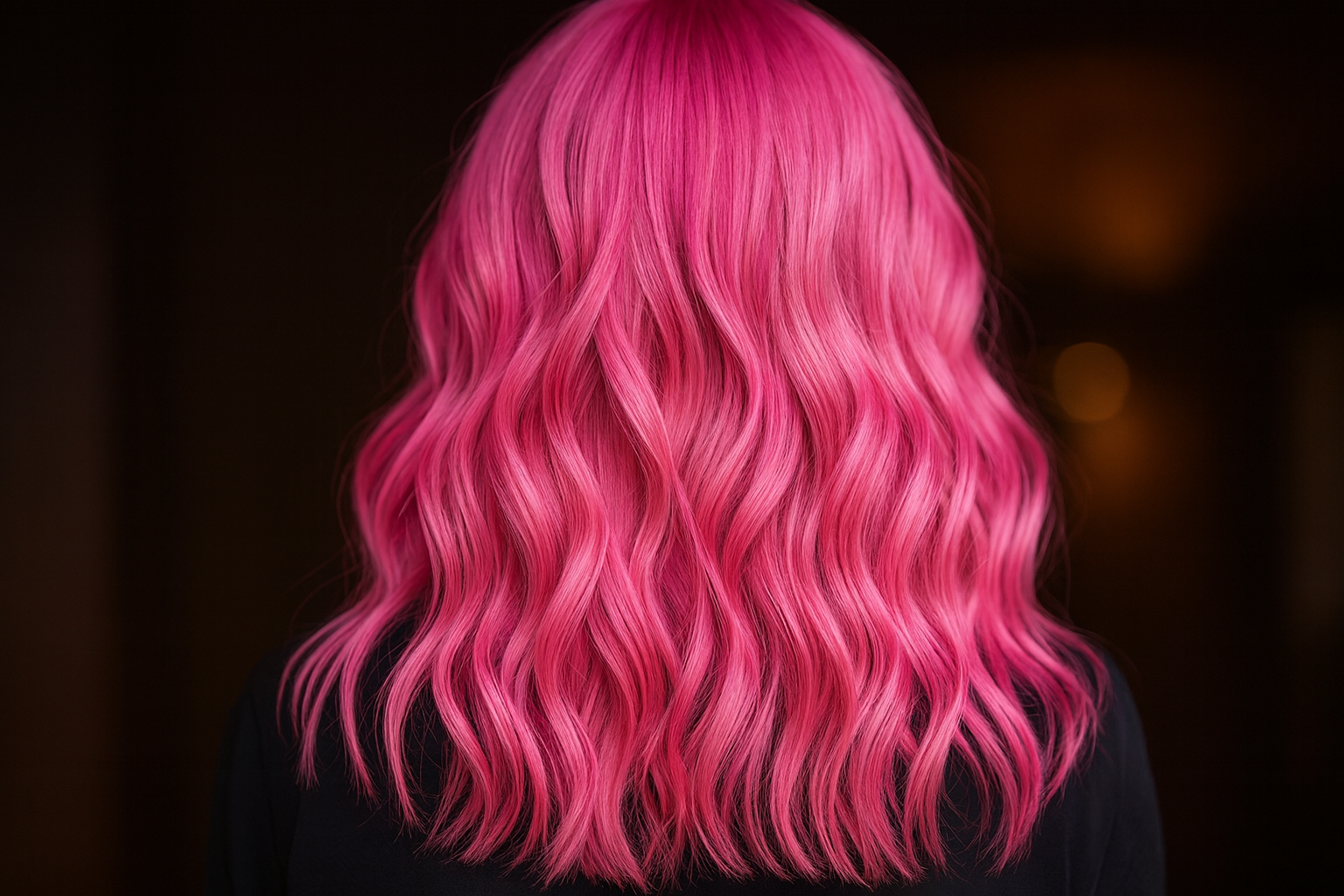
5) Images: crisp, stable, and small
Covers declare width/height to prevent CLS, and use modern formats with a fallback.
 loading="lazy" decoding="async"
alt="Back view of wavy, vivid pink hair in soft studio light">
Export tips
Use AVIF for photography (tiny files), WebP as the widely supported layer, PNG as last fallback.
Keep hero covers ≤ 280KB (AVIF/WebP), thumbnails ≤ 80KB.
6) Performance budget (the pink still flies)
I hold myself to a calm budget:
Critical CSS + JS < 170KB gzipped.
Fonts: two styles max, font-display: swap.
Defer non-critical scripts; hydrate only what needs JavaScript.
Build-time guardrails:
CI fails if bundle size grows by > 10KB.
A post-deploy smoke test hits /static/images/png/og-default.png and one /media/... to catch routing mistakes early.
7) Dark theme gotchas (and how I avoid them)
Dark pink can look muddy against near-black. I separate shadow from tint:
.card {
box-shadow: 0 8px 30px rgba(0,0,0,.35),
0 0 0 1px rgba(255, 63, 182, .12); /* pink edge */
}
Text overlays always get a neutral scrim so white copy sits at ~95% contrast, not 110% glare.
8) Designer → code handoff
Tokens live in one file. Figma uses the same names. That keeps designers and code aligned.
{
"color.pink.600": "#E22EA4",
"color.surface.900": "#16131A",
"easing.emphasized": "cubic-bezier(0.2, 0, 0, 1)",
"time.med": "220ms",
"radius.lg": "14px"
}
If a token changes, I can theme the site (e.g., lavender week) without rewriting components.
9) A quick “add a new pink” recipe
Pick a candidate hue and generate 400/500/600/700 steps.
Test three pairs in a contrast checker:
white on 600 / 700; dark-text on a light tint.
Drop the new step into --ring-pink and a demo button; inspect hover/active.
Check with prefers-reduced-motion and keyboard focus.
Ship behind a flag for a day and watch Lighthouse + user feedback.
10) Checklist I actually run
Body/heading contrast passes (AA)
Keyboard-only journey works
Focus rings visible on every control
prefers-reduced-motion respected
CLS < 0.02 for article pages
OG image renders per post (fallback present)
Bundle size within budget